Here are some steps to create variable rate prescription maps in QGIS; hopefully they will be useful. First; import your geographic information in QGIS. then Next use the raster calculator to combine your input layers into a single raster that represents the variable rates. In the end; define the formula based on your particular instructions needs. At last; make sure the output raster matches your requirements for geotiff format. Finally, export this raster layer as a geotiff file.
I haven’t actually used the VR but I played with it some. Basically I uploaded a .shp file into qgis and then adjusted the colors of each zone as a scale of red based on 0-255. So if your max rate is set at 255 and your min is at zero, if you want to target 80, set the red value at 80 and all other colors at zero. It’s important that green is at zero. In a nut shell and no field experience lol. Good luck
I trialed some software called “Pix4Dfields”. It’s built exactly for this sort of thing; especially for creating variable rate maps from aerial multi-spectral images.
For example, I could create a grid of specified dimensions, and overlay an aerial image and field boundary. You can also get vegetative index layers in there too, and then have the software fill the prescription grid layer based on math or indexes or whatever you can come up with.
Exporting in a format for my DJI drone was a breeze. The whole workflow is really simple easy and intuitive. The only downside is… you guessed it, cost. Upwards of $3k for a perpetual license or $300+ month to month. I don’t even know if I have a good use for it yet, but I’d like to play around with the ability to generate VR maps for my drone and to explore for other stuff in the future.
This got me wanting to replicate the workflow from an aerial image(s) to a geotiff VR map in QGIS.
I think I figured it out. The key was something called “zonal statistics” which can do calculations on a raster image over an area defined by a vector layer.
I can share some screenshots if anyone else is interested.
What image format is the rate controller crowd using for prescriptions? Is it based on vector shapes? I haven’t played with any of the rate controller stuff yet.
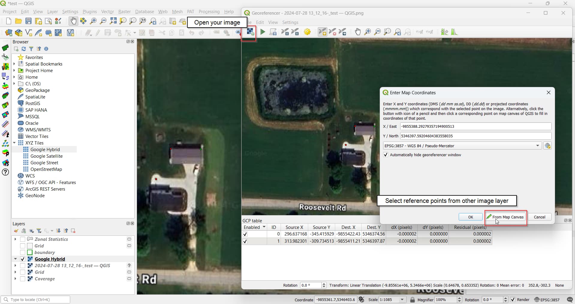
a. Open your image
b. Click reference points on the image.
c. Correlate them to another image layer in the project with the “From Map Canvas” button
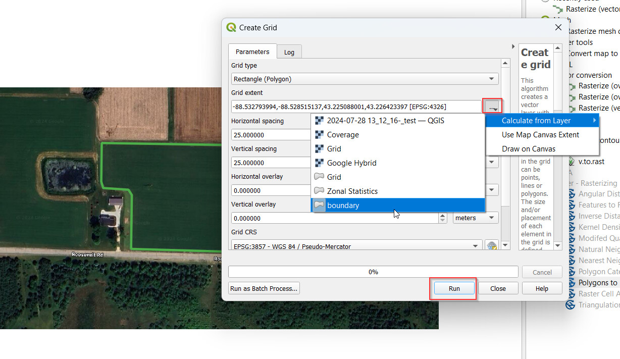
Create/import a boundary polygon. I drew one, but you could also import a .shp file for a field boundary
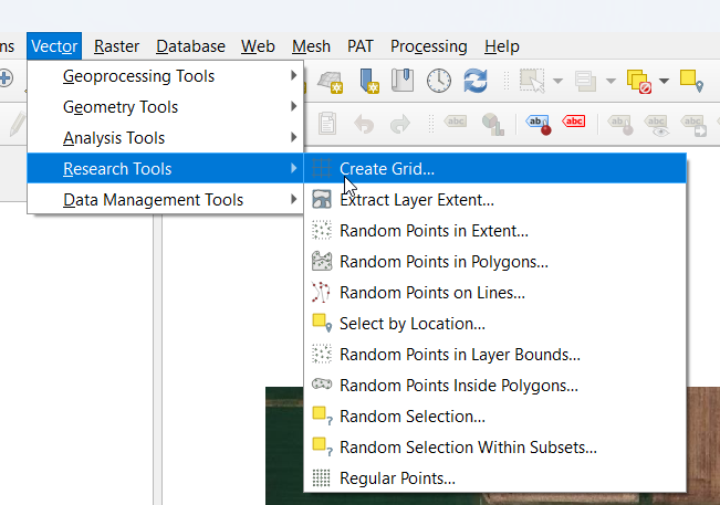
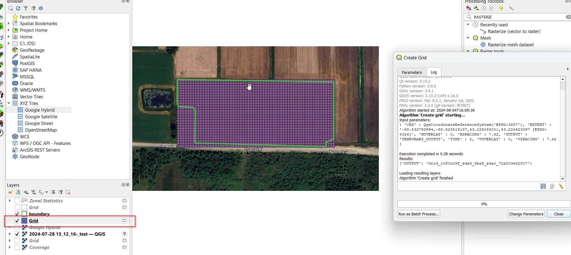
Create the grid using Vector->Research Tools->Create grid
a. Fill out the fields in the dialog.
b. Choose grid type. I used a rectangle (square)
c. Grid extent: use the “…” button to select Calculate from Layer->“your boundary path layer”.
d. Horizontal/vertical spacing = dimensions of the rectangle. I chose 25 feet for both, just in this practice case.
e. Click “Run”. It should create a new layer and something that looks like a grid!
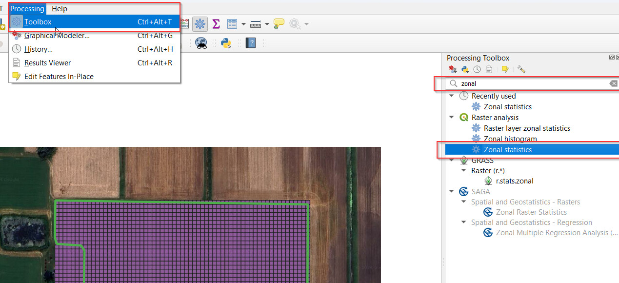
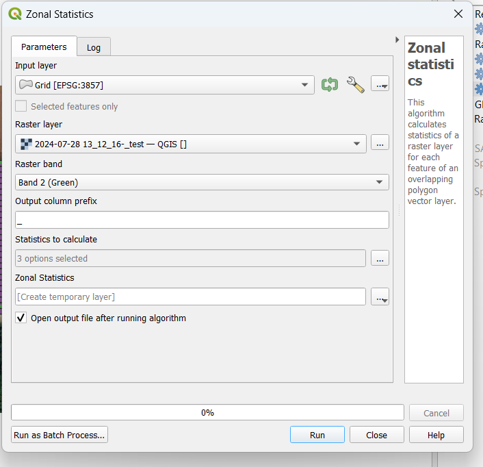
Run “Zonal Statistics” to perform a calculation over the grid cells. You are essentially setting up a calculated data column for each vector shape or cell in the grid. The end goal in my case, was to have an average of the “green” in each grid cell for the aerial image.
a. Show the processing toolbox sidebar by clicking Processing->Toolbox
d. Input layer: this is the grid layer. select the grid layer you just created.
e. Raster layer: this is the image layer that it will do the calcs on
f. Raster band: the color of each pixel of an image is described by Red, Green, and Blue values. You’re choosing which color band to use for the calculations here. I chose “Band 2 (Green)” in this practice example.
g. Output column prefix: you have to put something here, not sure why. What ever you put here gets appended as the prefix to the data columns that get calculated.
h. Statistics to calculate: click the “…” to choose. I only chose “mean”, which means this calculation will essentially just calculate the average green-band value for each grid cell.
i. Click “Run”.
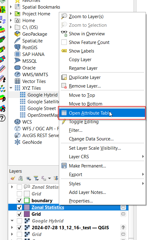
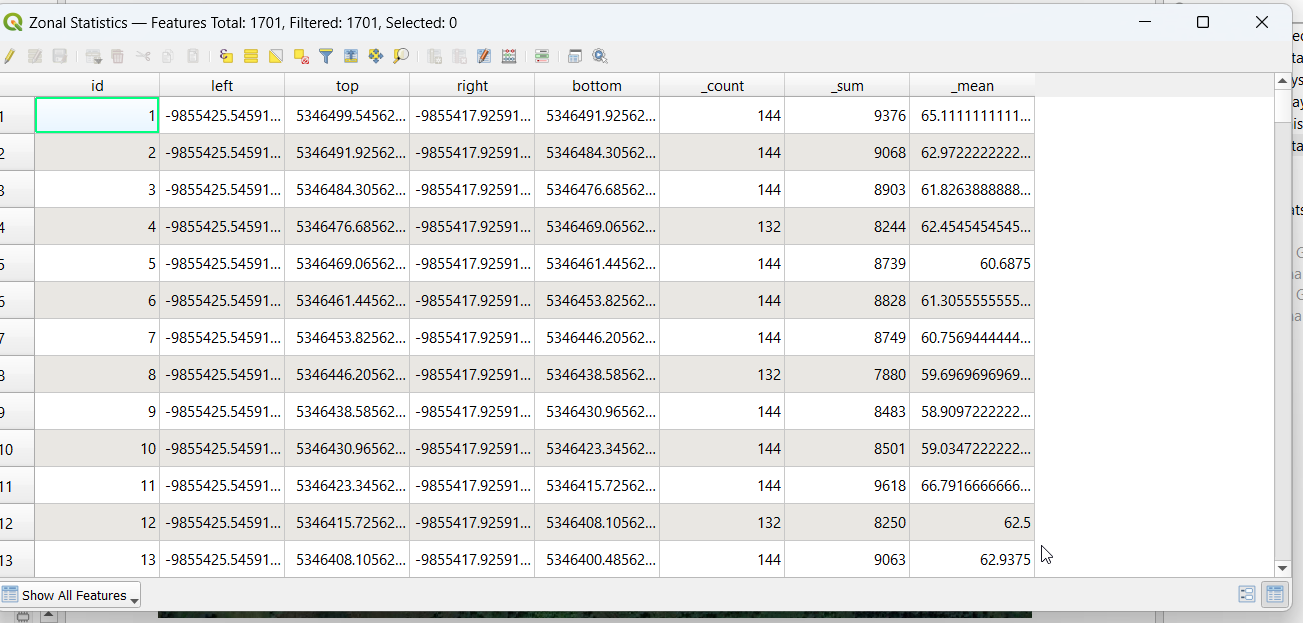
6. A new grid layer gets created. You can check the calculated values by right clicking the newly created “Zonal Statistics” layer → Open attribute table.
You can see the calculated data columns. Each row is a cell in the grid. In this case, I accidentally had selected mean, sum, and count as calculated statistics. I only really wanted the mean for what I was trying to do.
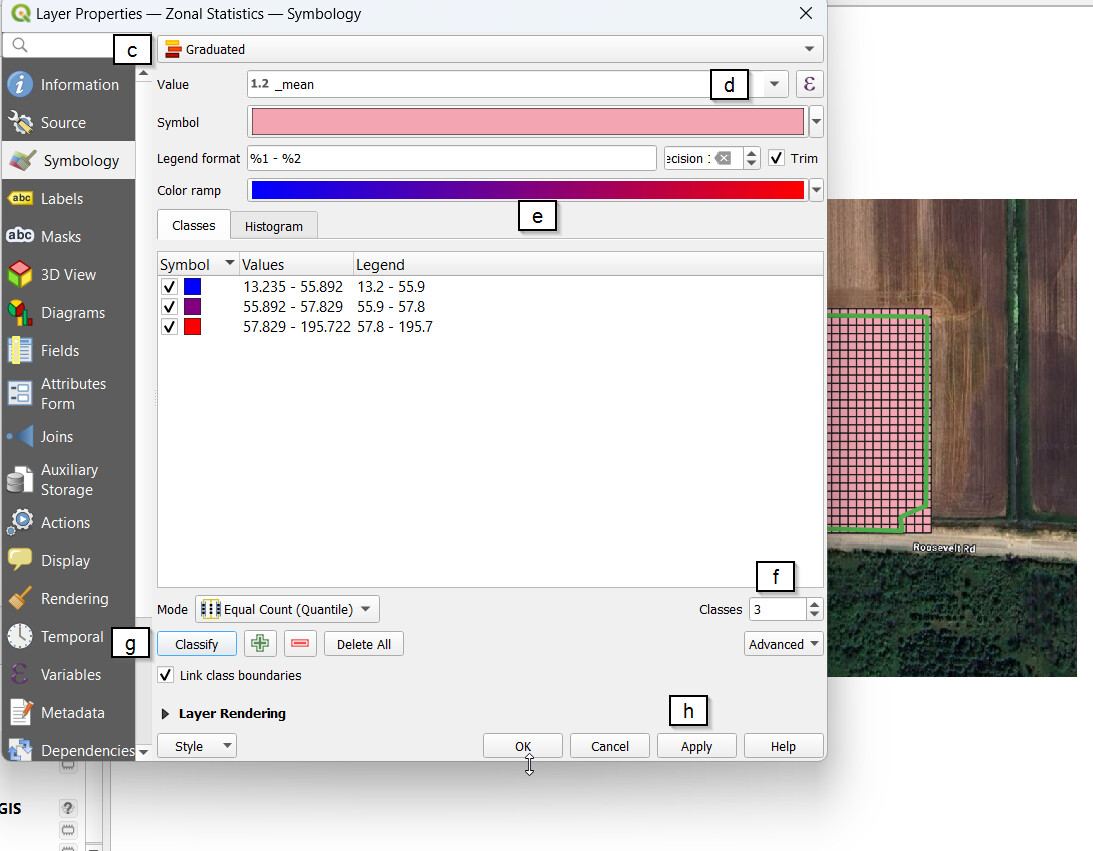
7. Now that I had a calculated average for each grid cell, I wanted to color the grid along a spectrum based upon that value.
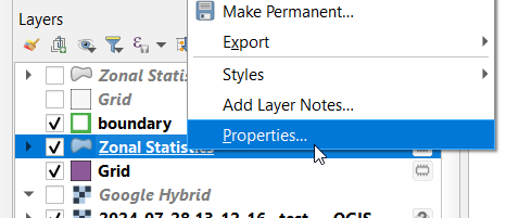
a. Right click on the Zonal Statistics layer->Properties
b. Go to the “Symbology” section
c. Select “Graduated”
d. Value: Choose the value that will be used to determine the fill color. In this case, I wanted the calculated “_mean”
e. Choose the color ramp you want. I did blue to red.
f. Classes: This is the number of color stages/zones you want. I chose 3. You could increase or decrease, depending what exactly you want for an application map.
g. Click “Classify”. This creates buckets/color zones. I think you can play with the “Mode” a bit to tweak how the different zone values/criteria are created. I haven’t really yet.
Hi! im been trying to do the same work, i have done a similar process but i cant figured out how to get the .shp into a .tiff or .tifw whit the rate of gal/acre or l/ha for the prescription. Do you solve that problem, it would be a great info for me.