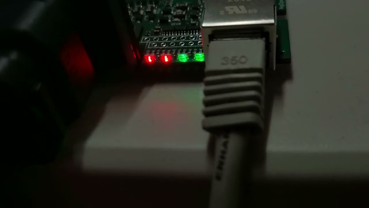
What progression of color/blinks do you think represents 4 stages of readiness?
I see RED as “bad/worst” & GREEN as “good/best” so Solid Red being the “lowest” (more red is more bad) and Solid Green the “highest” with the two blinking red/green in the middle as seen in this video close to the beginning and right at the end. The LED (#2) that is changing color/blink modes starts with Solid Red → Blinking Red → Blinking Green → Solid Green. Is that an intuitive progression? These also have a blue element in each RGB but I’m aiming to use blue flashes for RTCM data on the GPS LED and maybe a blue flash on the Steer LED when Steer btn is pressed.
For example on the GPS LED:
solid red = no fix
blinking red = position but no RTK/FLOAT
blinking green = FLOAT
solid green = full RTK
blue flashes = RTCM data received
Steer LED:
solid red = WAS signal error (out of range or no input)
blinking red = WAS signal is good but no steer data from AoG
blinking green = ready to steer
solid green = steering active/engaged
These are the RGB LEDs on my new AiO Prototype.
I can also see where blinking red is the lowest level, as in an error/fault condition because blinking is more attention getting but if “red is bad” then solid red is “more bad” then blinking red.
- I like your style
- Blinking red should be the first stage
- I think I have a better idea (please share)

